
Music Notes
For the “Music Notes” I made a banner and three shirts Troy University’s School of Music using Adobe Illustrator.
For the banner I was given what to write and used the colors and fonts that the University has been marketing with. from there I added imagery of different music instruments and notes to make it clear that the banner is meant to promote the school of music. I made them a lighter shade of red than the background to make them blend in just enough that the text is what stands out the most.
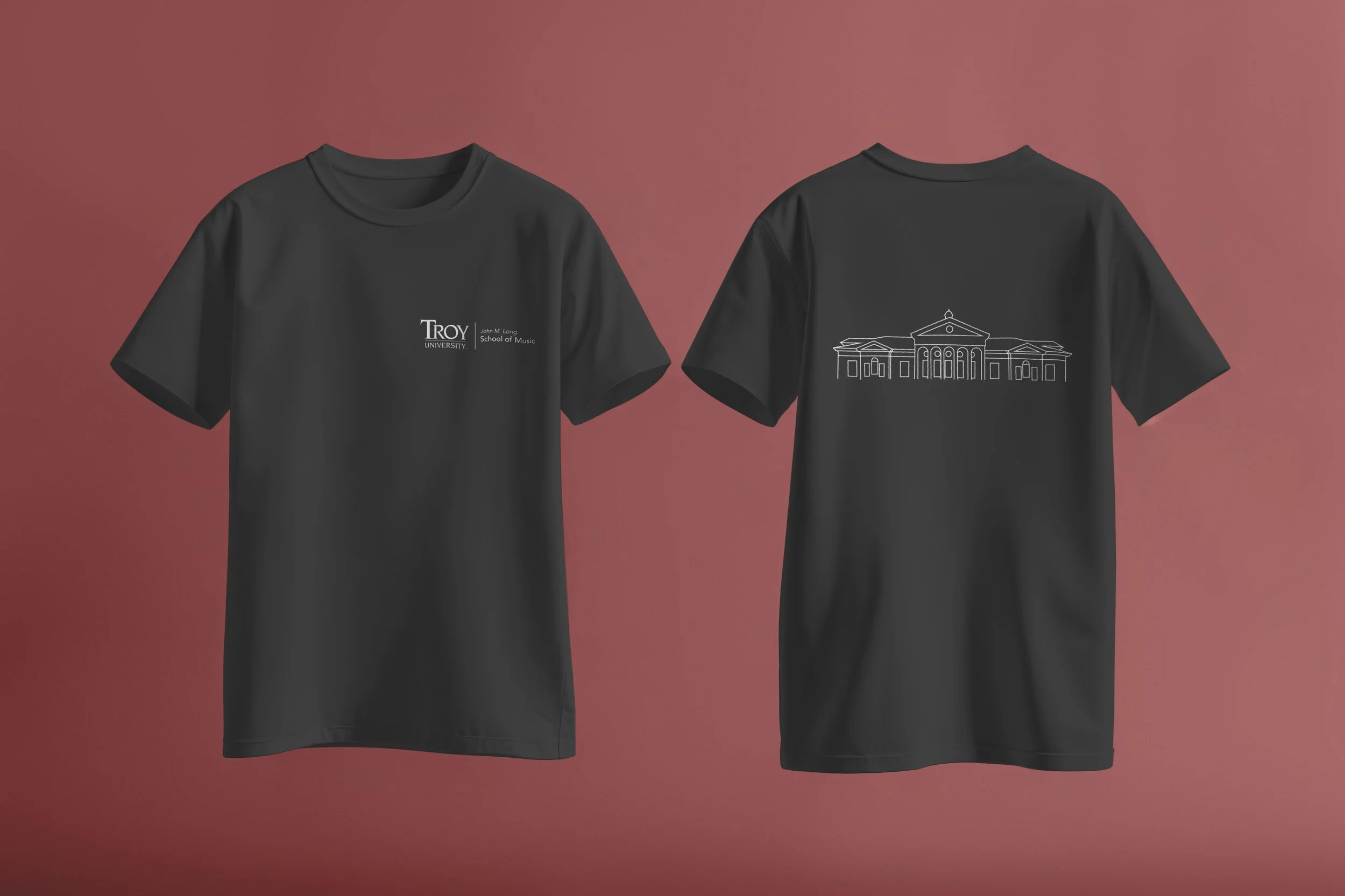
For the first t-shirt I drew a line drawing of the school id music’s building because it is a big part of the school and well known. I wanted to keep this design simple, so I made the art all one color. I chose the black and white colors because they complement each other well. I put the design on the back of the t-shirt with the University’s logo on the chest of the front because this is a very popular way to do t-shirt’s that I think not only looks the best but is also very functional.
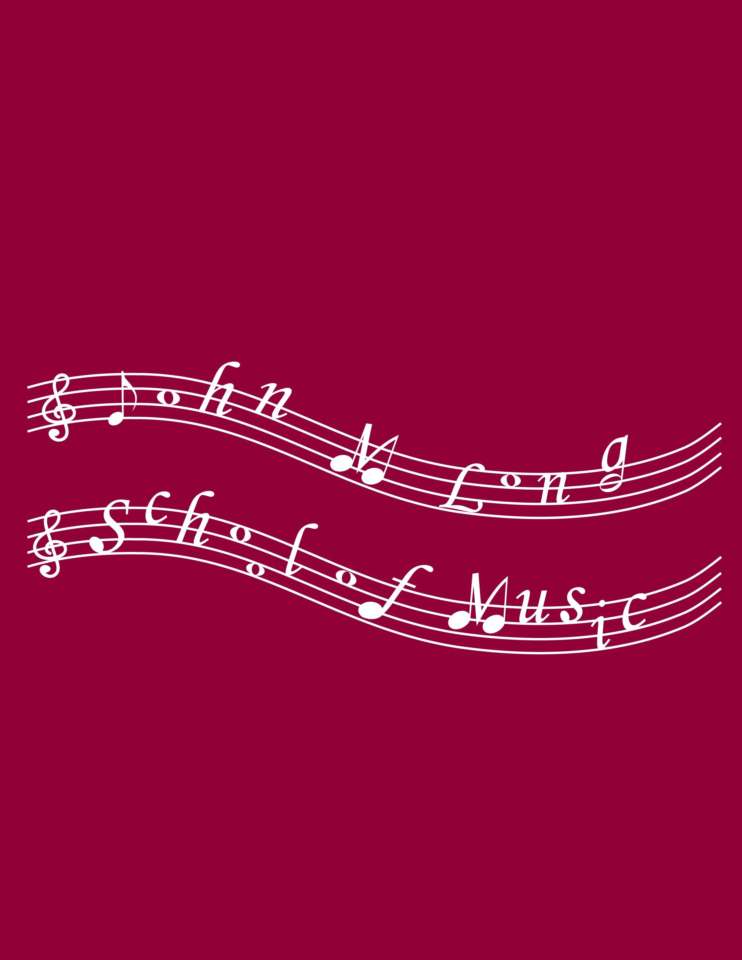
The second t-shirt I made represents music notes, but instead of using the notes I put name of the school. Certain letters that have a vertical line I made the bottom look like a note so it would be clearer the words are notes. I again made this shirt have the design on the back with the logo on the front chest. I made this shirt red with the white design because many of the shirts at the University are red with white designs and I thought it would the best for this design.
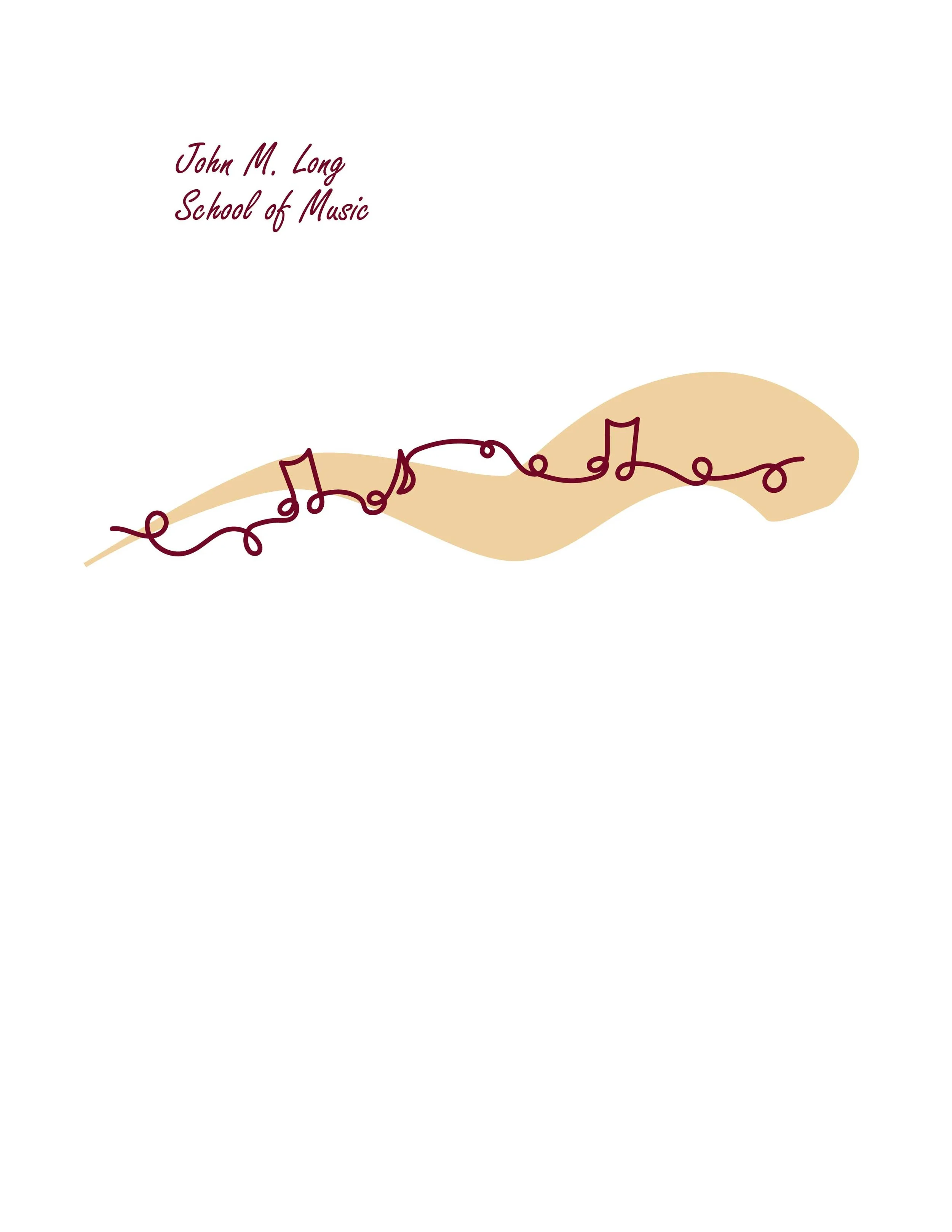
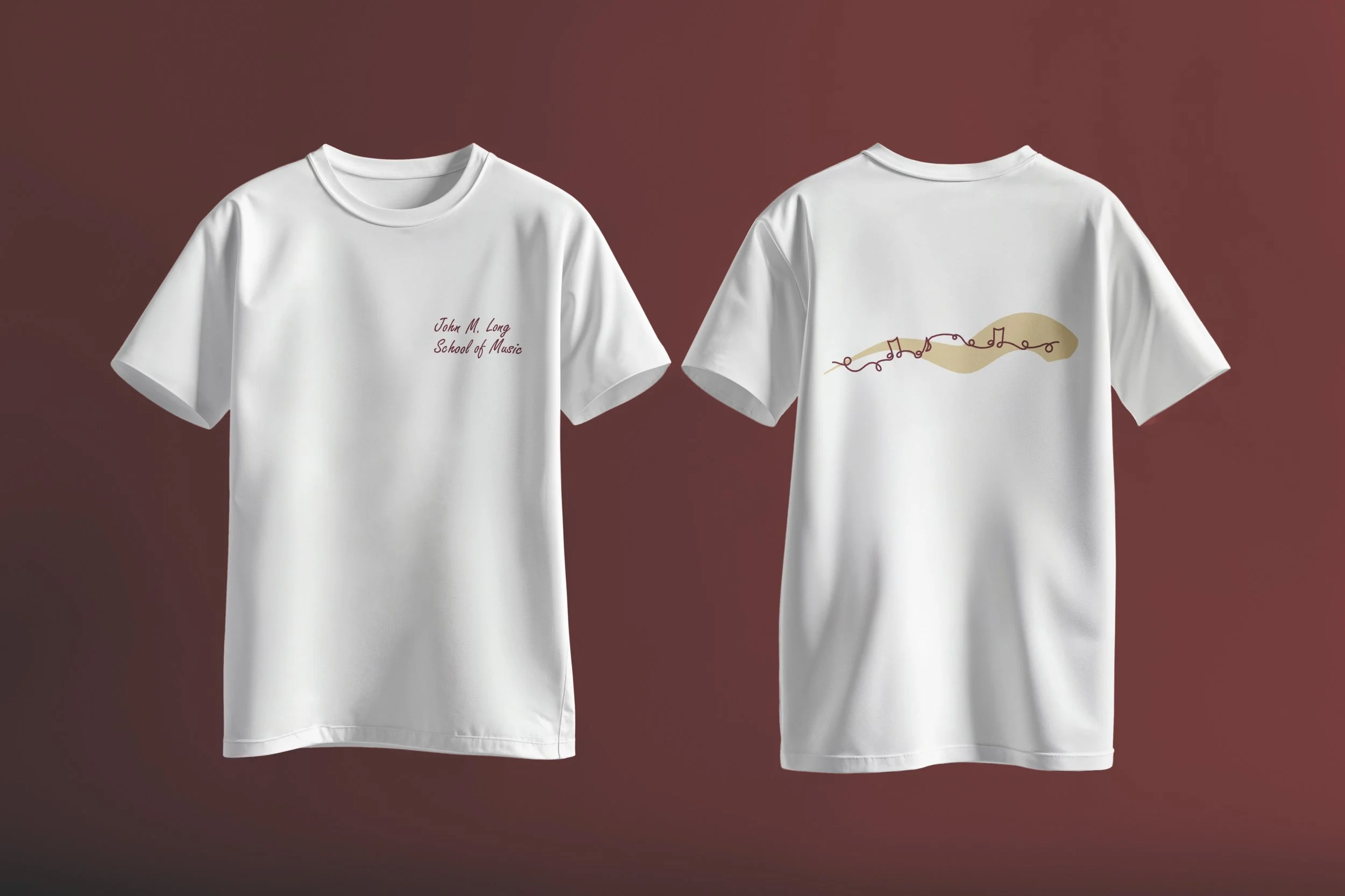
For the third t-shirt I made a line drawing of music notes. I then put a thick colored line behind to give the design more dimension. For the front of the shirt, I put the name of the school in a font that worked well with the design on the back.